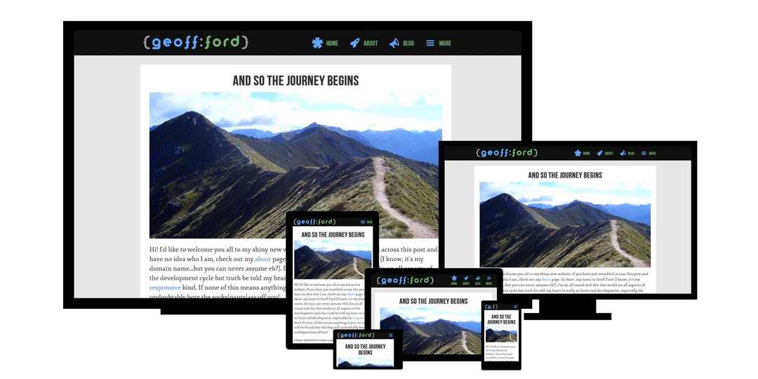
Responsive Web Design: The Essentials
In a world, where PCs and mobile devices had separate websites...
A few yeas ago (May 25, 2010), Ethan Marcotte posted an article on A List Apart entitled Responsive Web Design. That article has grown to become one of the most influential and definitive articles ever published in our industry and started a revolution around our whole approach to web design. He has also followed this up with a book in the excellent A Book Apart series.
So what exactly is Responsive Web Design?
The basic concept is that one website can serve many different devices of all shapes and sizes. No need for the mobile only website. What is mobile anyway? We now have such a huge variety of devices from smartphones to tablets and everywhere in between. At both extremities we have tiny screened smart watches and gigantic TVs, and who knows what is around the corner! How can we ever hope to keep up? Certainly not by designing a different website for each of these device 'categories'.
Ethan outlines three tools/techniques that collectively can deliver the holy grail of website design, one website to rule them all! Let's take a look at each of them and build a basic example as we go.
Fluid Grid
This first technique was one of the main precursors to responsive web design. Ethan himself had written about fluid grids a year prior. Before the dawn of smart phones we mostly designed for desktop with fixed width grids. Every year or two we would revise our designs for the most common screen size of the day, be it 800, 1024 or 1280px wide. Even before mobile, these differences alone warranted a different approach.
With the right special ingredients (percentage and em) we can create flexible, fluid layouts. With a little help from max-width we can also constrain these layouts so things don't get out of hand on large screens. And of course every magic recipe needs a secret formula. This one helps us to convert from pixels to em and percentage.
Target / Context = Result
Let's say that we wish our overall site width to not exceed 1200px. Any screens larger than this will see side padding via an auto margin. Any smaller screens will see our fluid layout compress proportionately (instead of our arch enemy, the horizontal scroll bar). We will also work within a 12 column grid which at 1200px wide has columns of 80px wide with left and right margins of 10px each.
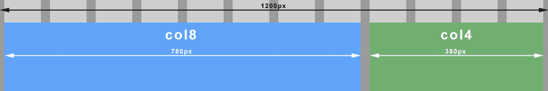
<div class="container">
	<div class="col8">
	</div>
	<div class="col4">
	</div>
</div>
body {
	margin: 0;
}
.container {
	margin: 0 auto;
	max-width: 1200px;
}
.col8 {
	float: left;
	width: 65%;  /* 780px / 1200px = 0.65 */
	margin: 1em 0.83%;  /* 10px / 1200px = 0.0083 */
}
.col4 {
	float: left;
	width: 31.66%;  /* 380px / 1200px = 0.3166 */
	margin: 1em 0.83%;  /* 10px / 1200px = 0.0083 */
}
Fluid Images
With all the flexibility provided by fluid grids, fixed width elements like images could quickly look out of place or disproportionate on large screens. They could just as easily break our layout on small screens when the container becomes smaller than the image itself. The trick here is to put our image in a fluid container and set the image to always fill its container (max-width: 100%).
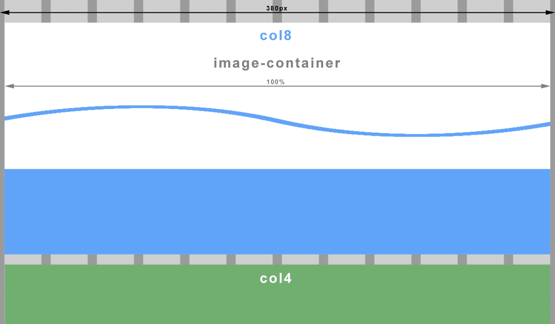
Using our earlier grid example, let’s float the image top left of the 8 column container and make it 4 columns wide (with a right margin). The important thing to note here is that the context has changed. We must now divide our desired image container width (target) by its 8 column container (context).
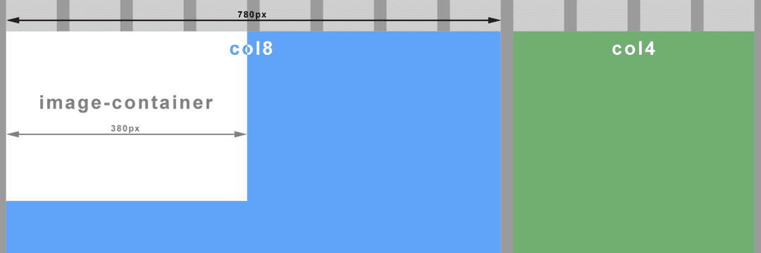
...
<div class="col8">
	<div class="image-container">
		<img src="images/my_image.png" />
	</div>
</div>
...
.image-container {
	float: left;
	width: 48.71%;  /* 380px / 780px = 0.4871 */
	margin-right: 1.28%;  /* 20px / 780px = 0.0256 */
}
img {
	max-width: 100%;
}
Note your image must be of a sufficient size/quality so as to not look terrible on larger screens when the container is stretched. If you have constrained your overall layout with max-width as above, you can calculate the maximum width of the image container, and so the image (380px in our example).
Media Queries
This is where the real magic begins. To be fluid and flexible is nice, but to be responsive is better still. Media queries, a feature of CSS3, allow us to change tack depending on certain specified conditions such as a change of screen width or device. I won’t delve into the evolution of the media query here, just to point out that we will be working with the media type ‘screen’ for all the examples.
Imagine viewing our earlier example on a small screen. At some point our image will be too small to see any detail. Let’s prevent that from happening by changing the width of the image container to the full width of it’s parent (col8), effectively doubling the image width when the screen is smaller than a particular size (600px). Let’s create a ‘breakpoint’.
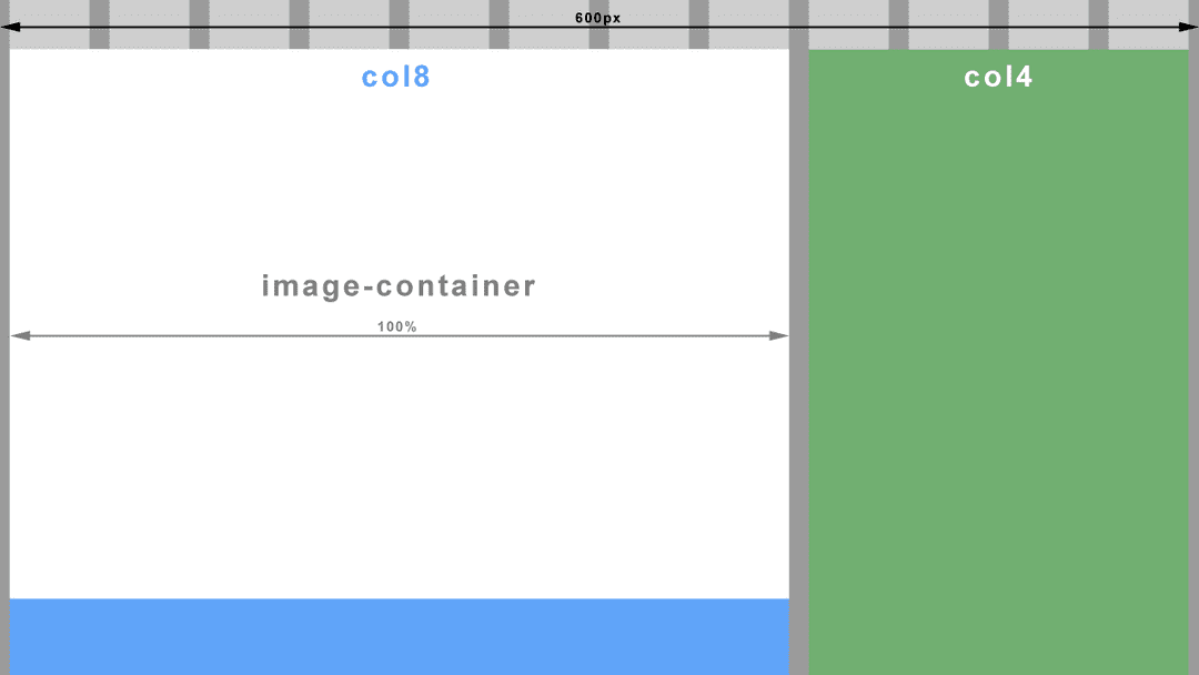
@media screen and (max-width: 600px) {
	.image-container {
		width: 100%;
		margin-right: 0;
	}
}
On an even smaller screen, both our column containers (col8 and col4) would be so narrow that sentences would wrap after every two or three words. One solution could be to make all the columns the same full width and stack them on top of each other. Another breakpoint anyone?
@media screen and (max-width: 380px) {
	.col8, .col4 {
		width: 98.33%;  /* 12 columns (exc. margins which stay at 0.83% each) */
	}
}
Size Does Matter, But Which One?
Throughout this article I have referred to screen width and screen size when what I actually mean here, is the viewport. If you’ve never heard of it before, it is apparently a window in a spacecraft! It is also however, the visible area of a web page. To put it another way, the viewport is the browser window. If you change the size of the browser window, you change the size of the viewport, which in turn triggers our media queries. I’m sure you have done this many times already when testing out the code from above (If you haven’t yet, go ahead and I’ll wait for you…..cool ha?).
Well that all sounds pretty straight forward...doesn’t it?
Not quite. Historically, mobile browsers had to deal with the problem of displaying websites with fixed width layouts on a screen with a smaller resolution than the website. The solution was to specify their own viewport size for the browser wherein the browser would ‘pretend’ to be bigger than the resolution of it’s device. A larger website would then be scaled down to fit. The result unfortunately is an unreadably small website that you have to pinch and zoom (scale) to make out any detail. Then of course you have to drag the website back and forth just to read a sentence. We have all been there.
Moving on to present time, most smartphones have screens of at least 1280px wide in landscape and 720px in portrait and all crammed into less than 5 inches. The newer models come with Full HD 1920px by 1080px! No need for mobile browsers to pretend anymore. But hang on, that doesn’t fix the scaling problem. What we really need here is more control over the viewport so we can put an end to this madness and work within a predictable environment.
Thankfully Apple invented the viewport meta tag. This tag allows us, the designers, to tell the browser what size we would like the viewport to be. Better still, all good browser vendors implemented this tag so we now have a uniform way to control the viewport size.
<meta name="viewport" content="width=device-width,initial-scale=1.0">What we are doing here is telling the browser that we wish the viewport width to be the same as the device’s actual screen width (changeable depending on rotation). We also instruct the browser not to zoom in or out by setting the scale factor to 1.
So what does this achieve?
If we threw a regular old fixed width layout at a mobile browser with the viewport meta tag set as above, we wouldn’t have achieved very much. Due to the large screen resolutions of modern devices, you would still have a tiny website displayed and probably with part of it cut off in portrait view. However, we aren’t building fixed width layouts anymore because they suck!
What we have achieved here is to level the playing field. We can now use max-width and min-width (which both relate to viewport width) in our media queries and get predictable results, regardless of the mobile browser. High five!! ...no? okay, maybe next time.
Now all we have to do is put sensible breakpoints (media queries) in our layout to create the best viewing experience for that viewport width. A word to the wise, do not try to build layouts for specific device classes like phone, tablet, phablet, etc. This is a moving target with screen resolutions getting higher all the time and new device classes appearing like smart watches. Use your design instinct here and insert a breakpoint when your layout begins to fail.
And with that I will leave you to experiment. Have fun!
Next in the series - Responsive Web Design: Mobile First & Progressive Enhancement