 \n \n \n
 \n
There are several branching strategies out there but none more popular than Vincent Driessen’s GitFlow model. His model allows for the usual mainline master and dev branches, and also feature, release and hotfix branches. This may be overkill for some, but if you have more than a few developers working on the same team and on several different features of the same codebase, it can help you to hang on to your sanity (what little you have left anyway).
\nThe original blog post above is an excellent reference, but I wanted to provide a more detailed workflow. The examples below employ quite a verbose usage of the various Git commands for clarity’s sake. For example I always include source/destination branches (local and remote) when pulling, pushing, merging, etc. If you are certain your branch tracking is setup correctly, you can of course use the shorter form commands. Personally, I don’t like to leave things to chance so I would rather be explicit and confident of the expected outcome.
\nThe master branch is automatically created when you create a new Git repository. Master branch should only store code that is \'release\' ready. Deployment to live/production is only ever done from a tag created on this branch.
\nThe dev branch is sometimes referred to as the \'integration\' branch. It begins life as a branch from master. All developed code (from feature branches) is eventually merged into this branch. Dev branch reflects the current state of \'developed\' code but not necessarily release ready (a release may require several features).
\nFeature branches provide an isolated environment to develop an application feature without the risk of potentially harmful changes either from you or other developers affecting each others code. This means you can experiment and even ditch your feature without any impact on other development. Feature branches are always created from, and eventually merged back into dev branch. Once merged, they can be deleted as all your feature code is now in dev branch.
\nRelease branches allow us to take a snapshot of the code at any given time and effectively freeze it from any other development. When any finished features branches have been merged back into dev branch, tested and are ready for production, we can checkout a release branch from dev. On occasion the release may need to be ‘polished’ with some minor changes (no new functionality here!). When complete, the release branch can be merged into master, tagged with a release number i.e. 3.2, tested and deployed. Don’t forget to also merge the release branch back into dev to add any release tweaks that might have been made. As with feature branches, release branches have a limited existence, they can be deleted once merged with master and dev branches.
\nSo your new feature passed all the tests you created, was included in a release and is now out in the wild on your live website. Then boom! You notice a bug that wasn’t captured by your tests. Depending on the severity, you may need to roll back your production environment to the previous release tag. Whatever you do though, you’re going to have to fix that bug. This is where we create a hotfix branch from master to implement our bug fix. Once complete we can merge the hotfix into master, tag it with a release number i.e. 3.2.1, test and deploy. As with release branches, we also need to merge the hotfix into dev branch to fix the same bug there.
\nFeature branches are always branched from dev.
\n$ git checkout -b my_feature_branch origin/devAny work completed is then committed to your local working copy of the feature branch. You can of course also push this branch to origin if anyone else needs to work on elements of this feature.
\n$ git push origin my_feature_branchThey can then checkout their own working copy of the feature branch.
\n$ git checkout -b my_feature_branch origin/my_feature_branchAs with any branch, after you have committed your changes but before pushing it to origin, you must pull from origin to ensure all code is merged correctly and fix any merge conflicts that might occur.
\n$ git commit -m”my awesome feature changes”\n$ git pull origin my_feature_branch\n...\n... if any merge conflicts, fix and commit again\n...\n$ git push origin my_feature_branchWhen a feature is complete, it must be merged back into dev. Note that if dev branch has been altered since the feature was checked out, you may have some merge conflicts to fix. These must resolved and committed.
\n$ git checkout dev\n$ git pull origin dev\n$ git merge --no-ff my_feature_branch\n$ git push origin devNote the use of the --no-ff option. If dev had not changed since we checked out the feature branch, Git could simply fast forward when merging. This however results in a linear history with no recollection of a feature branch ever existing. By telling Git to not allow a fast forward merge, a commit object is created and the history of the feature branch is retained.
\nOnce the feature branch has been successfully merged, it can be deleted both locally and on origin as it is no longer required. Note you may have to change branch as you can’t delete the branch you currently have checked out.
\n$ git checkout dev\n$ git branch -D my_feature_branch\n$ git push origin :my_feature_branchIf you are using Git 1.7.0 or above you can also use the following alternative to delete remote branches:
\n$ git push origin --delete my_feature_branchWhen you have all the required features for your next release merged into dev and tested, you are ready to create a release branch.
\n$ git checkout -b release_3.2 origin/devAny minor tweaks can be made and committed to this release branch. There shouldn\'t be a need to push this branch to origin unless several developers need to collaborate on the tweaks. Remember the rule here is no new functionality. When the release is complete and tested, we can merge it into dev and master branches. We can also delete the release branch once merged.
\n$ git checkout dev\n$ git pull origin dev\n$ git merge --no-ff release_3.2\n$ git push origin dev\n$ git checkout master\n$ git pull origin master\n$ git merge --no-ff release_3.2\n$ git push origin master\n$ git branch -D release_3.2Now let\'s cut a tag on master.
\n$ git tag -a v3.2 -m"Release 3.2"\n$ git push origin master --tagsThis tag can now be tested and ultimately deployed to production.
\nWell done, give yourself a pat on the back. You\'ve done a great ... what\'s that you say? Someone has reported a bug? I don\'t think so, not in my ... oh yeah, look at that! So we now have a bug on our live application. Best get working on a hotfix!
\nWhen you’re done, as with release branches, you must merge the hotfix into both dev and master branches then delete it. We can then cut a new tag for testing and deployment.
\n$ git checkout -b hotfix_3.2.1 origin/master\n...\n... various magic performed and committed here\n...\n$ git checkout dev\n$ git pull origin dev\n$ git merge --no-ff hotfix_3.2.1\n$ git push origin dev\n$ git checkout master\n$ git pull origin master\n$ git merge --no-ff hotfix_3.2.1\n$ git push origin master\n$ git branch -D hotfix_3.2.1\n$ git tag -a v3.2.1 -m"Hotfix Release 3.2.1"\n$ git push origin master --tagsNow rinse and repeat!
\nCheck out my Git cheat sheet for a quick reference guide to the most used commands.
',frontmatter:{teaser:"How to manage features, releases and bug fixes with your favourite version control system (That'll be Git of course!)",date:"06 February 2014",path:"/blog/git-branching-and-release-strategy",title:"GIT Branching & Release Strategy"}}},pathContext:{prev:{html:'\n
A few yeas ago (May 25, 2010), Ethan Marcotte posted an article on A List Apart entitled Responsive Web Design. That article has grown to become one of the most influential and definitive articles ever published in our industry and started a revolution around our whole approach to web design. He has also followed this up with a book in the excellent A Book Apart series.
\nThe basic concept is that one website can serve many different devices of all shapes and sizes. No need for the mobile only website. What is mobile anyway? We now have such a huge variety of devices from smartphones to tablets and everywhere in between. At both extremities we have tiny screened smart watches and gigantic TVs, and who knows what is around the corner! How can we ever hope to keep up? Certainly not by designing a different website for each of these device 'categories'.
\nEthan outlines three tools/techniques that collectively can deliver the holy grail of website design, one website to rule them all! Let's take a look at each of them and build a basic example as we go.
\nThis first technique was one of the main precursors to responsive web design. Ethan himself had written about fluid grids a year prior. Before the dawn of smart phones we mostly designed for desktop with fixed width grids. Every year or two we would revise our designs for the most common screen size of the day, be it 800, 1024 or 1280px wide. Even before mobile, these differences alone warranted a different approach.
\nWith the right special ingredients (percentage and em) we can create flexible, fluid layouts. With a little help from max-width we can also constrain these layouts so things don't get out of hand on large screens. And of course every magic recipe needs a secret formula. This one helps us to convert from pixels to em and percentage.
\nTarget / Context = Result
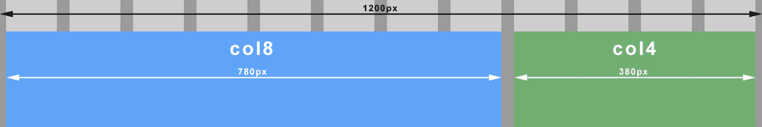
\nLet's say that we wish our overall site width to not exceed 1200px. Any screens larger than this will see side padding via an auto margin. Any smaller screens will see our fluid layout compress proportionately (instead of our arch enemy, the horizontal scroll bar). We will also work within a 12 column grid which at 1200px wide has columns of 80px wide with left and right margins of 10px each.
\n\n \n \n <div class="container">\n\t<div class="col8">\n\t</div>\n\t<div class="col4">\n\t</div>\n</div>\nbody {\n\tmargin: 0;\n}\n.container {\n\tmargin: 0 auto;\n\tmax-width: 1200px;\n}\n.col8 {\n\tfloat: left;\n\twidth: 65%; /* 780px / 1200px = 0.65 */\n\tmargin: 1em 0.83%; /* 10px / 1200px = 0.0083 */\n}\n.col4 {\n\tfloat: left;\n\twidth: 31.66%; /* 380px / 1200px = 0.3166 */\n\tmargin: 1em 0.83%; /* 10px / 1200px = 0.0083 */\n}\nWith all the flexibility provided by fluid grids, fixed width elements like images could quickly look out of place or disproportionate on large screens. They could just as easily break our layout on small screens when the container becomes smaller than the image itself. The trick here is to put our image in a fluid container and set the image to always fill its container (max-width: 100%).
\nUsing our earlier grid example, let’s float the image top left of the 8 column container and make it 4 columns wide (with a right margin). The important thing to note here is that the context has changed. We must now divide our desired image container width (target) by its 8 column container (context).
\n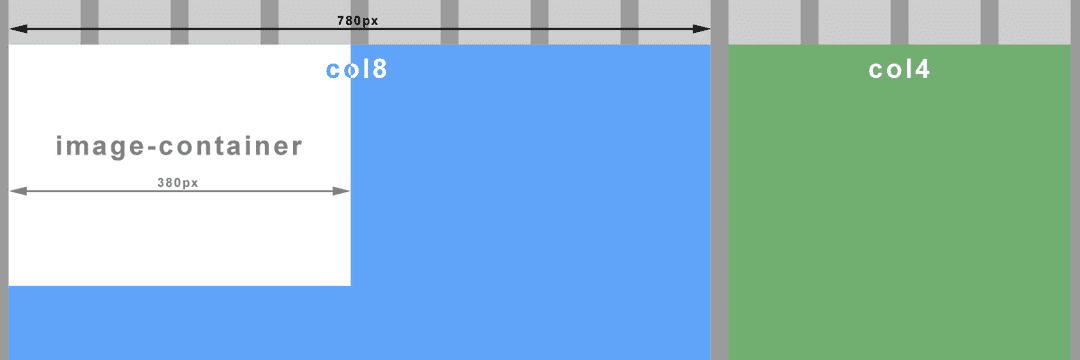 \n \n \n
 ...\n<div class="col8">\n\t<div class="image-container">\n\t\t<img src="images/my_image.png" />\n\t</div>\n</div>\n...\n.image-container {\n\tfloat: left;\n\twidth: 48.71%; /* 380px / 780px = 0.4871 */\n\tmargin-right: 1.28%; /* 20px / 780px = 0.0256 */\n}\nimg {\n\tmax-width: 100%;\n}\nNote your image must be of a sufficient size/quality so as to not look terrible on larger screens when the container is stretched. If you have constrained your overall layout with max-width as above, you can calculate the maximum width of the image container, and so the image (380px in our example).
\nThis is where the real magic begins. To be fluid and flexible is nice, but to be responsive is better still. Media queries, a feature of CSS3, allow us to change tack depending on certain specified conditions such as a change of screen width or device. I won’t delve into the evolution of the media query here, just to point out that we will be working with the media type ‘screen’ for all the examples.
\nImagine viewing our earlier example on a small screen. At some point our image will be too small to see any detail. Let’s prevent that from happening by changing the width of the image container to the full width of it’s parent (col8), effectively doubling the image width when the screen is smaller than a particular size (600px). Let’s create a ‘breakpoint’.
\n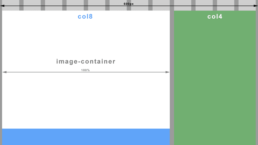 \n \n \n
 @media screen and (max-width: 600px) {\n\t.image-container {\n\t\twidth: 100%;\n\t\tmargin-right: 0;\n\t}\n}\nOn an even smaller screen, both our column containers (col8 and col4) would be so narrow that sentences would wrap after every two or three words. One solution could be to make all the columns the same full width and stack them on top of each other. Another breakpoint anyone?
\n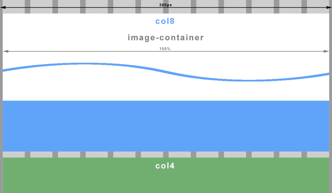 \n \n \n
 @media screen and (max-width: 380px) {\n\t.col8, .col4 {\n\t\twidth: 98.33%; /* 12 columns (exc. margins which stay at 0.83% each) */\n\t}\n}\nThroughout this article I have referred to screen width and screen size when what I actually mean here, is the viewport. If you’ve never heard of it before, it is apparently a window in a spacecraft! It is also however, the visible area of a web page. To put it another way, the viewport is the browser window. If you change the size of the browser window, you change the size of the viewport, which in turn triggers our media queries. I’m sure you have done this many times already when testing out the code from above (If you haven’t yet, go ahead and I’ll wait for you…..cool ha?).
\nNot quite. Historically, mobile browsers had to deal with the problem of displaying websites with fixed width layouts on a screen with a smaller resolution than the website. The solution was to specify their own viewport size for the browser wherein the browser would ‘pretend’ to be bigger than the resolution of it’s device. A larger website would then be scaled down to fit. The result unfortunately is an unreadably small website that you have to pinch and zoom (scale) to make out any detail. Then of course you have to drag the website back and forth just to read a sentence. We have all been there.
\nMoving on to present time, most smartphones have screens of at least 1280px wide in landscape and 720px in portrait and all crammed into less than 5 inches. The newer models come with Full HD 1920px by 1080px! No need for mobile browsers to pretend anymore. But hang on, that doesn’t fix the scaling problem. What we really need here is more control over the viewport so we can put an end to this madness and work within a predictable environment.
\nThankfully Apple invented the viewport meta tag. This tag allows us, the designers, to tell the browser what size we would like the viewport to be. Better still, all good browser vendors implemented this tag so we now have a uniform way to control the viewport size.
\n<meta name="viewport" content="width=device-width,initial-scale=1.0">What we are doing here is telling the browser that we wish the viewport width to be the same as the device’s actual screen width (changeable depending on rotation). We also instruct the browser not to zoom in or out by setting the scale factor to 1.
\nIf we threw a regular old fixed width layout at a mobile browser with the viewport meta tag set as above, we wouldn’t have achieved very much. Due to the large screen resolutions of modern devices, you would still have a tiny website displayed and probably with part of it cut off in portrait view. However, we aren’t building fixed width layouts anymore because they suck!
\nWhat we have achieved here is to level the playing field. We can now use max-width and min-width (which both relate to viewport width) in our media queries and get predictable results, regardless of the mobile browser. High five!! ...no? okay, maybe next time.
\nNow all we have to do is put sensible breakpoints (media queries) in our layout to create the best viewing experience for that viewport width. A word to the wise, do not try to build layouts for specific device classes like phone, tablet, phablet, etc. This is a moving target with screen resolutions getting higher all the time and new device classes appearing like smart watches. Use your design instinct here and insert a breakpoint when your layout begins to fail.
\nAnd with that I will leave you to experiment. Have fun!
\n\n
Next in the series - Responsive Web Design: Mobile First & Progressive Enhancement
',id:"/home/geoff/www/cornerpiece/geoffford.co.uk/src/pages/blog/23-02-2014-responsive-web-design-essentials/index.md absPath of file >>> MarkdownRemark",frontmatter:{date:"2014-02-23T02:31:49Z",path:"/blog/responsive-web-design-essentials",title:"Responsive Web Design: The Essentials"}},next:{html:'\n
The term \'Content First\' has been bandied about for a couple of years now and over that time it has come to mean different things to different people. A common driver behind these variations is the concept of mobile first design. At least as far as thinking about how best to deliver content to smaller devices with limited screen real estate. Whilst there is certainly a confluence between these two approaches, I\'ll concentrate on the former here and write up a separate article on the latter.
\nSome of the different takes on content first that I have encountered include:
\nIn my opinion they each bring some value to the table, and a combination of them all can bring yet more value.
\nAs far as I can trace back, this concept began with a blog post from Mark Boulton entitled A Richer Canvas. Mark points out that whilst there have been unquestionable principles for content layout in use for hundreds of years, these rules and methods begin with paper. "Paper that has edges, ratios that can be repeated." Designing for the web does not of course provide us with the luxury of a defined \'canvas\' or repeatable page. Mark suggests:
\n\n\n"...we need to shed the notion that we create layouts from a canvas in. We need to flip it on its head, and create layouts from the content out."
\n
Shortly after, Jeremy Keith made a follow up post and coined the term \'Content First\'. Jeremy talks mostly about layout here and in particular how that content can be presented differently on different devices. He goes on to say:
\n\n\n"I think there\'s a general agreement amongst web designers that we should be designing from the content out but there\'s still an over-reliance on canvas-in tools like predefined grids."
\n
Regarding the limitations of screen size on mobile devices Luke Wroblewski, the originator of Mobile First, tells us:
\n\n\n"There simply isn\'t room for any interface debris or content of questionable value. You need to know what matters most."
\n
Luke is also the coiner of \'content first, navigation second\'. Which is to say, prioritise your content up front on smaller screens and minimise the navigation.
\nFrom the off, start thinking about how you can deliver an optimal experience for users of smaller devices, phones, tablets, phablets (I guess it sounded better than \'tones\'?), etc. This doesn\'t mean just thinking about your layout and navigation (although these are obviously important elements). It also means thinking about your content and specifically which content is important. This means finding the right balance of what you want to push out to your readers and what your users actually want. A little research here can go a long way!
\nGet your ruthless head on and cut the crud! Bin all that fluff that doesn\'t really need to be there other than for the purpose of filling a space on larger screens. Warning! As the power surges through your newly liberated self, carving through your content like a hot knife through butter...try not to get too carried away. If a side bar provides truly useful supporting information, then fine...it gets to live and see another day.
\nOnce you have your optimised content, let\'s help your users to access this goldmine of information in an efficient way. When I load up a website on my mobile browser, I don\'t want to have to scroll down through swathes of site header artifacts like logos, taglines, search boxes, and let\'s not forget your all important site navigation. I want the \'good stuff\' and I want it now! Or in other words, prioritise your content. There are various tried and tested methods of minimising the valuable screen estate used by your site navigation whilst providing a more meaningful user experience appropriate to that device. I\'ll get to that later in a Mobile First article.
\nThe variations in layout and presentation that we have referred to here are possible through another much talked about design approach, Responsive Web Design. One of the key principles of RWD is the use of CSS media queries which allow us to define different styles that are \'triggered\' when a condition is met such as a particular screen size. A lot of folk create these \'breakpoints\' in their design based on common device screen sizes like 320px, 480px, etc. This however, has nothing to do with the content. It is the content itself that should dictate when the design needs to change as a screen becomes larger. Test how your content looks as you increase the screen size, and when it starts to look crap, insert a breakpoint and change your presentation to something more appropriate.
\nIn summary, de-cluttering your content can really help you focus on what is important to your readers/customers/target audience and, more importantly, allow them to access this content more efficiently. Defining the breakpoints in your layout where the design fails the presentation of your content is more useful than just following assumed device dimensions.
', id:"/home/geoff/www/cornerpiece/geoffford.co.uk/src/pages/blog/07-11-2013-content-first-I-want-the-good-stuff-and-I-want-it-now/index.md absPath of file >>> MarkdownRemark",frontmatter:{date:"2013-11-07T11:21:39Z",path:"/blog/content-first-I-want-the-good-stuff-and-I-want-it-now",title:"Content First: I want the good stuff and I want it now"}}}}}}); //# sourceMappingURL=path---blog-git-branching-and-release-strategy-626dee8939acbb7859a1.js.map