 \n \n \n
 \n
Welcome to the second post in my Responsive Web Design series. If you haven't already, check out the first post on the essentials of responsive web design.
\nWhen responsive web design first came on the scene, most of us were still caught up designing for desktop and mobile separately. At first it might have seemed that we no longer needed our mobile websites anymore as we could now just scale down our desktop sites. A few max-width media queries here and there and we were good to go. It quickly became apparent however that this approach alone was not enough.
\nThe suggestion of a mobile first design approach actually precedes that of responsive web design. Luke Wroblewski first coined the term back in his November 2009 blog post, unsurprisingly named Mobile First. This was later followed up by a book in the A Book Apart series. Luke had observed the huge growth in mobile internet access pushed on by the rapidly growing adoption of smartphones. This indicated that not only should we be prepared for this growth, but we should embrace it wholeheartedly and turn our usual design approach on its head. The fact that mobile websites were designed for devices with limited screen real estate and unreliable bandwidth meant they had to be focused, uncluttered and light. What desktop website wouldn't benefit from some of that lean goodness?
\n\n\n"So when a team designs mobile first, the end result is an experience focused on the key tasks users want to accomplish without the extraneous detours and general interface debris that litter today's desktop-accessed Web sites. That's good user experience and good for business."
\n
In addition, mobile browsers opened up more possibilities than your standard desktop browser with location via GPS, cameras, NFC (Near Field Communications), etc. Whilst support for these features has been patchy, it has improved with every new release.
\nEverything Luke brought to our attention about the benefits of thinking 'Mobile First' fit like a glove with the goal of responsive web design, one website to rule them all. It had been difficult to decide where all these desktop page elements (clutter) were going to fit on our small smartphone screens. And what about our navigation, hover effects, images, etc? Desktop websites that had been given the responsive overhaul were still too heavy and not always thought out very well. Navigation was frequently bunched so close together that you couldn't always hit the desired target. Some also relied on hover effects to indicate their presence and/or state which left visitors bemused.
\nSo let's start out fresh! With a limited amount of space available, we have to get ruthless and cut out the crud. This part of the approach goes hand in hand with another known as 'Content First' which stresses not only uncluttered, leaner content, but also the priority of content over other elements like navigation. Who wants to scroll down through all of your navigation links to find what they actually came to see ... your content!
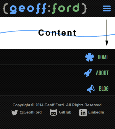
\nLet's assume you have now binned any unnecessary page elements and are ready to tackle the primary site navigation. Whether left or right handed, most people use their thumb when operating a phone with one hand. It therefore stands to reason that your navigation should be placed at the bottom of the screen. Having said that, smartphones are getting bigger all the time so single handed operation may not be possible for those with smaller hands. Let's play along for now though and place our navigation at the end of our content (Note this also means it isn't getting in the way of our all important content). We are also going to make sure that each navigation item allows enough space for our chubby fingers to prevent any unexpected behaviour.
\n ...\n\t\t<section class="site-content">\n <div class="wrapper clearfix">\n <section class="main">\n\t\t\t\t...\n\t\t\t\tYour content here\n\t\t\t\t...\n </section>\n <nav id="site-nav">\n <a name="nav"></a>\n <ul class="nav-list">\n <li><a href="/">Home</a></li>\n <li><a href="/about">About</a></li>\n <li><a href="/blog">Blog</a></li>\n </ul>\n </nav>\n </div>\n </section>\n <footer class="site-footer">\n\t\t...\n#site-nav {\n display: block;\n width: 100%;\n}\n.nav-list {\n display: block;\n list-style-type: none;\n padding: 0;\n margin: 0;\n width: 100%;\n}\n.nav-list li {\n display: block;\n width: 100%;\n}\n.nav-list li a {\n display: block;\n padding: 0 1em;\n text-align: right;\n font-size: 1.4em;\n line-height: 2.4em;\n height: 2.4em;\n white-space: nowrap;\n}\nThis is a good start but hang on, doesn't this mean we now have to scroll all the way through our content to get to the nav? Well, yes it does. So let's make that a little easier by putting a subtle but obvious link at the top of the page that will whisk us down to our navigation. The most common form for this link is the faithful 'hamburger' link. I use an icon font this but you can use SVG or just an image if you want. The first two are preferable as they scale well.
\n <header class="site-header">\n <div class="wrapper">\n <a href="/" id="header-logo">Your SVG/Icon/Image Logo Here</a>\n <a href="#nav" id="site-nav-toggle" class="icon-alone">Your SVG/Icon/Image Hamburger Here</a>\n </div>\n </header>\n#site-nav-toggle {\n float: right;\n margin: 10px 10px 0px 0px;\n border: 0;\n outline: none;\n font-size: 22px;\n line-height: 22px;\n}\nGreat stuff, looking good. Content is up front and center where it should be and our main navigation is out of the way but easily accessible. It turns out however that not everyone is a fan of this approach and can get confused when they suddenly find themselves at the bottom of the page after clicking on our hamburger button. This is especially obvious if you don't have many navigation items as they don't fill the screen and so the bottom of your content is visible above. We need some help.
\n \n \n \n
 As far back as 2003, two men (Steve Champeon and Nick Finck) were challenging what had for almost 10 years prior been an accepted strategy for delivering content - Graceful Degradation. The original idea was that when certain 'newer' features were not recognised by older browsers, the important content would still be visible, whilst the 'extras' would gracefully disappear without making a scene. This could be achieved for example by browser (and version) specific style sheets through various hacks. Unfortunately this wasn't as ideal as it sounds. Firstly designers rarely looked back beyond the previous version of a given browser which left all the users of older versions with a suboptimal experience. Also these webpages were cluttered with elements that were utterly useless to these older browsers and just added unnecessary weight.
\nTheir proposition - Progressive Enhancement - suggested turning the old approach on its head (sound familiar?) and starting out with the basic content. We could then, where the required support was available, add the bells and whistles to our base. That way everyone could be happy, from the most basic content experience up to the fully featured, 'throw everything at it' version.
\nIn its most basic form, progressive enhancement refers to a base of semantically marked up content, which can then be enhanced by separate CSS styling where supported. The content can then be further enhanced by JavaScript (again where supported), maybe by including additional content via an AJAX call.
\nToday there are many libraries and techniques that help us to check for support of all sorts of features including the CSS3 and HTML5 palettes. In some cases we can even add those features to non supporting browsers with some black magic known as polyfills.
\nWhilst progressive enhancement tells us to include features only where support is available, another approach is to add that missing support, normally via JavaScript. Remy Sharp was the first to coin the term 'Polyfill' when trying to describe something that adds an API to a browser that doesn't already have native support.
\nHere are a few polyfills that I use regularly:
\nEarlier we created our mobile first navigation that sits at the bottom of the screen for browsers that don't support JavaScript. For those that do, we can move the navigation back up top and enhance it with a nice show/hide effect (with a little help from jQuery) behind our hamburger button.
\n$(document).ready(function() {\n\t$('#site-nav').insertAfter('.site-header').css('display','none');\n\t$('#site-nav-toggle').attr('href','#').click(function(e) {\n\t\t$('#site-nav').slideToggle("fast");\n\t\te.preventDefault();\n\t});\n});\n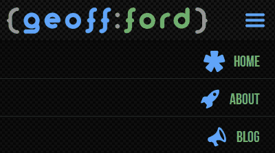 \n \n \n
 Let's take things a step further and change our navigation at different break points so we get a more traditional navigation menu in larger viewports. I have tried to achieve this without the help of JavaScript.
\n@media screen and (min-width: 50em) {\n // Position the navigation block top right\n #site-nav {\n display: block;\n position: absolute;\n top: -65px;\n right: 0px;\n bottom: auto;\n left: auto;\n width: auto;\n }\n // Display navigation items inline\n .nav-list {\n float: right;\n width: auto;\n background: none;\n border-bottom: none;\n }\n .nav-list > li {\n width: auto;\n float: left;\n display: inline;\n border: none;\n }\n .nav-list > li > a {\n background: none;\n float: left;\n text-align: center;\n font-size: 1.4em;\n line-height: 1.4em;\n padding: 0;\n margin-left: 1.6em;\n margin-top: -10px;\n }\n // Hide the hamburger button\n #site-nav-toggle {\n visibility: hidden;\n }\n}\nWe have a small problem now that if JavaScript is enabled, the earlier code would have already moved our navigation block to a different location and we would get unexpected results from our CSS media queries. Ideally we want to move our navigation block back when the above media query matches. Using an awesome little library called enquire.js, we can replicate our CSS media queries and trigger our enhancements at specific break points. Let's replace the earlier JavaScript with the following:
\n// Move navigation block for smaller viewports and move back when match lost (larger viewports)\nenquire.register("screen and (max-width: 49.9em)", {\n\tmatch : function() {\n\t\t$('#site-nav').insertAfter('.site-header').css('display','none');\n\t\t$('#site-nav-toggle').attr('href','#').click(function(e) {\n\t\t\t$('#site-nav').slideToggle("fast");\n\t\t\te.preventDefault();\n\t\t});\n\t},\n\tunmatch : function() {\n\t\t$('#site-nav').insertAfter('.main').css('display','block');\n\t\t$('#site-nav-toggle').off('click');\n\t}\n});\n// Display navigation block for larger viewports and hide when match lost (smaller viewports)\nenquire.register("screen and (min-width: 50em)", {\n\tmatch : function() {\n\t\t$('#site-nav').css('display','block');\n\t\tmenu.init();\n\t},\n\tunmatch : function() {\n\t\tmenu.destroy();\n\t\t$('#site-nav').css('display','none');\n\t}\n});\n \n \n \n
 I couldn't discuss progressive enhancement and not mention one of the best tools in the box. Modernizr allows you to test for specific CSS3 and HTML5 feature support. It then adds CSS class names to the html element to show which tested features are supported. You can then precede your own class names with the Modernizr ones to ensure your styles are only applied when that feature is supported. Maybe I will cover this in another article, but please do check it out.
\nSo there you have it, a base navigation that is optimised for mobile first, then progressively enhanced with CSS and JavaScript. The same principles can and should of course be applied to other aspects of your design. And you can take the whole progressive enhancement idea much further with dynamically loaded page elements via Ajax etc. Let's allow everyone to enjoy their encounter with your website regardless of browser or device and access your content in an appropriate way.
',frontmatter:{teaser:"Responsive web design may have set us on a new journey of discovery, but mobile first and progressive enhancement have become the beacons that guide us along the right path.",date:"08 March 2014",path:"/blog/responsive-web-design-mobile-first-and-progressive-enhancement",title:"Responsive Web Design: Mobile First & Progressive Enhancement"}}},pathContext:{prev:{html:'\n
AngularJS is a MVW (Model/View/Whatever) JavaScript framework that extends HTML through additional markup and produces more expressive and readable code. Its packed feature set make it a firm favourite for anyone developing SPAs or complex JavaScript based front ends.
\nThrough the use of AngularJS directives, filters and expressions we can build more declarative UIs. This means we don\'t have to get bogged down with how to bend and shape the DOM of a html template view to our will. We can just declare what we want and where. This not only reduces development time but also leaves us with clean, intuitive code.
\nThe whole MVW or MVVM (Model/View/View-Model) approach that AngularJS is well known for is possible due to it\'s View-Model or Scope as it is referred to in these parts. An application\'s scope sits between its view and its controller. From one side the controller can add variables and functions to the scope which can in turn be used by (bound to) the view. Okay, so not that impressive right? However AngularJS can also bind the view, or to be more specific HTML form fields back to the scope. What does this mean? Live Preview baby! Any changes made to the model by the view will be seen by the controller. And vice versa, any changes made to the model by the controller will be immediately visible in the view. This means the scope model is considered the single source of truth.
\nOne of the big advantages of the above is that it is all achieved without a page reload anywhere to be seen. After the initial page load of an AngularJS application, any changes to the view (model data, partial views, etc) are performed automatically. How does it do that you ask? You might imagine that AngularJS loads the DOM as a string and parses it, updating as it goes then returning the updated string back to the browser to reload the DOM. This wouldn\'t be very efficient however as every small change would require the whole DOM to be updated, again and again. What actually happens is that the AngularJS Compiler service traverses the actual DOM looking for directives and expressions and then links these elements to the scope. It achieves this by registering listeners to the elements and placing watches on the scope. Anything changes in either the view or the scope, the other is updated instantly without a complete reload of the DOM. End result? A very responsive, fast application.
\nAn age old problem of testing lies with the dependencies of our code. If dependencies, such as a call to an API, are declared directly within the code itself, tests will forced to use the very same (and possibly production) API call. The problem here is that our tests need to use consistent data input so that the outcome of our code can be correctly predicted. In our example, using a call to a live API could provide data that has been modified between tests and so taint the expected outcome. We can of course mock the service with our own pre-set and consistent data (like a fixture), but how can we tell our code to switch services when testing? The easiest way of managing this is to inject the required service into our code module as a dependency. The code can then utilise whichever service we supply and so provide the flexibility we need. This approach doesn\'t only help with testing, it also makes our code infinitely more re-usable.
\nThankfully, AngularJS was built with testing and the Separation Of Concerns (SoC) principal in mind from the outset and implements dependency injection throughout. Everything from components such as services, directives and filters to controllers and even module config can receive an array of dependencies to be injected. Nice!
\nAngularJS comes with a lite version of jQuery aptly called jqLite built in. So if you are a fan of jQuery selectors for example, you can continue to use these within your AngularJS code. Should you discover you need to use a full blown version of jQuery, just make sure it is loaded before AngularJS and it will be used instead of jqLite.
\nDownload or link to the CDN of the latest version of AngularJS (1.3.8 at the time of writing) in our html template (index.html):
\n<!DOCTYPE html>\n<html> \n<head>\n\t<script type="text/javascript" src="https://ajax.googleapis.com/ajax/libs/angularjs/1.3.8/angular.min.js"></script>\n</head>\n<body>\n...\n</body>\n</html>\nIn keeping with SoC, AngularJS applications are built in a modular fashion to promote code re-use and more maintainable and easily testable code.
\nLet\'s create an example AngularJS application module (app.js):
\nvar app = angular.module( \'myApp\', [] );\nThe first argument is the name of the module. The second is an array of dependencies to be injected (of which we don\'t have any in this basic example).
\nNow we include the module file in our html template:
\n<head>\n\t...\n\t<script type="text/javascript" src="app.js"></script>\n\t...\n</head>\nAnd finally we need to bootstrap the application using our very first built-in directive ng-app (more on directives later):
\n<html ng-app="myApp">\n...\n</html>\nAngularJS allows us to bind JavaScript-like expressions directly into a html template. The expressions can perform numerical and string operations or can refer to a variable/model within the scope.
\n<p>1 + 2 = {{ 1 + 2 }}</p> \n \n<p>Hello {{ customer.firstName }}</p>\nAn application\'s business logic is defined within its controllers. We can define our application\'s behaviour here as well as set the initial state of the controller\'s new child scope.
\nFirst we need to create a controller and attach it to our application module (app) using the controller() method. The first argument is where we define the name of the controller and the second is the controller\'s constructor function (along with its dependencies):
var app = angular.module( \'myApp\', [] ); \n \napp.controller( \'CustomerController\', [ \'$scope\', function( $scope ) { \n \n\t$scope.customer = {\n\t\tfirstName: \'Peter\',\n\t\tlastName: \'Parker\',\n\t\tphoto: \'pparker.jpg\',\n\t\tisMember: true\n\t}; \n \n}]);\nAs you can see above, we have also initialised a \'customer\' object within the controller\'s scope. In real world examples of course this sort of data would probably be provided by an API service (injected as a dependency of the controller) rather than hard coded like this.
\nAlso note that whilst we are adding our controller to the same file as the module here (app.js), you can and probably should define your controllers in separate files (to be covered in a later article).
\nNow to access our controller\'s scope (and all the values, objects and methods etc. associated with it) from within a html template, we must attach the controller to some relevant html element using another of the AngularJS built-in directives:
\n...\n<div ng-controller="CustomerController">\n\t<p>Dear {{ customer.firstName }} {{ customer.lastName }},</p>\n</div>\n...\nNote that we can only access the controller\'s scope from within the bound element. If we tried to place {{ customer.firstName }} anywhere outside of the div bound to the CustomerController, it would be ignored.
As we have already seen earlier, AngularJS comes ready to roll with built-in directives. These directives allow us to extend standard HTML to help us build web applications. All AngularJS built-in directives use the namespace \'ng\' at the start i.e. ngApp, ngController, etc. (note the camelCase here). However, when we use the directives in html the camelCase is substituted for hyphenation i.e. ng-app, ng-controller, etc.
\nBelow is a selection of some of the most commonly used directives:
\nng-app
Used to auto-bootstrap an AngularJS application and also defines the root element of the application by whichever element the directive is placed on (usually <html> or <body>).
<html ng-app="myApp">\nng-controller
As we saw earlier, this directive is used to attach an existing AngularJS controller to a element within the html template. Remember, the controller\'s scope will only be available within the element that it is bound to.
<div ng-controller="CustomerController">\n...\n</div>\nng-show / ng-hide / ng-if
All three of these directives accept an expression to be evaluated. The first two are self explanatory i.e. they will show or hide whatever element they are attached to if their expression evaluates to true. The ng-if directive is similar to these but with one main difference. Whilst ng-show and ng-hide merely use CSS to show/hide the element, ng-if actually removes the element (and its contents) from the DOM if its expression evaluates to false and recreates it if true.
<div ng-if="customer.isMember">\n...\n</div> \n \n<div ng-hide="!customer.isMember">\n...\n</div>\nng-click
Attaches a click handler to an element. When the bound element is clicked, the method passed to the handler is run. The method must of course first be defined in the controller and added to the scope.
app.controller( \'CustomerController\', [ \'$scope\', function($scope) { \n \n\t$scope.updateCustomer = function() {\n\t\t...\n\t\tsome code to save the customer changes back to the API\n\t\t...\n\t}; \n \n}]);\n<button ng-click="updateCustomer()">Save Changes</button>\nng-src
The problem with dynamically setting the source of an <img> element is that the data in the scope won\'t be available for the browser to pre-load as AngularJS hasn\'t parsed the DOM yet. AngularJS provides a solution with the ng-src directive. As the <img> will initially have no src, no attempt will be made to pre-load. Once the DOM has been parsed, AngularJS can set the src.
Won\'t work (well it might but only after an additional request):
\n<img src="http://www.example.com/photos/{{ customer.photo }}" />\nWill work:
\n<img ng-src="http://www.example.com/photos/{{ customer.photo }}" />\nng-repeat
So far so good, but ng-repeat steps up the excitement levels! No? Just me then. This powerful directive lets us iterate over a collection of items, such as an array of objects, applying a template to each item. In other words, a big time saver.
Let\'s say we have an array of fruit objects in a controller:
\n$scope.fruits = [\n {\n name: \'Bananas\',\n stock: 5\n },\n {\n name: \'Apples\',\n stock: 2\n },\n {\n name: \'Oranges\',\n stock: 3\n }\n];\nNow we want to list those healthy snacks out in a html template along with the current stock level:
\n<ul>\n\t<li ng-repeat="fruit in fruits">{{ fruit.name }} ({{ fruit.stock }})</li>\n</ul>\nYep that\'s it! I told you it was cool. We attach the ng-repeat directive to the element we wish to replicate for every item, for example the <li> element. Each item in the fruits array from our controller scope is assigned its own scope, in this case named fruit. We can then insert our AngularJS expressions to place our data where required.
Outputs:
\nOnce again AngularJS gets us started with a bunch of built-in filters that allow us to create subsets of, limit, order or format the output of an expression. They are preceded by the | symbol (to pipe our data through the filter) followed by the filter component name. This is then followed by a : and any filter arguments.
\n{{ expression | filter:arguments }}\nHere is a selection of a few of them:
\ncurrency
Format the expression to a currency with the provided symbol:
{{ 1234 | currency:"£" }}\nOutputs: £1,234.00
\ndate
Formats the expression (a date object, or milliseconds for example) to the provided date format:
{{ 1420070401000 | date:"dd/MM/yyyy HH:mm:ss" }}\nOutputs: 01/01/2015 00:00:01
\nfilter
Creates and returns a subset array from the provided filter expression array (such as an array of objects used in a ng-repeat) based on the expression argument (a string, a pattern object or a predicate function). Let\'s use our earlier ng-repeat example and apply a couple of different filters.
String example:
\n<ul>\n\t<li ng-repeat="fruit in fruits | filter:\'an\'">{{ fruit.name }} ({{ fruit.stock }})</li>\n</ul>\nOutputs:
\nPattern Object example:
\n<ul>\n\t<li ng-repeat="fruit in fruits | filter:{ name:\'es\', stock:3 }">{{ fruit.name }} ({{ fruit.stock }})</li>\n</ul>\nOutputs:
\nPredicate Function example (requires the function to be defined in the controller\'s scope):
\n$scope.filterByLowStock = function(fruit) {\n\treturn fruit.stock < 5;\n};\n<ul>\n\t<li ng-repeat="fruit in fruits | filter:filterByLowStock">{{fruit.name}} ({{fruit.stock}})</li>\n</ul>\nOutputs:
\nCustom
Once you get the hang of the built-in offerings, have a go at creating your own custom filter.
There was a significant omission from the earlier introduction to AngularJS built-in directives by the name of ng-model. This directive is the final piece in the 2 Way Data Binding puzzle and let\'s us bind html form fields to a model defined in the controller\'s scope. Assuming we use the earlier defined CustomerController, let\'s take a look at a basic example:
\n<p>Customer name: {{customer.firstName}} {{customer.lastName}}</p> \n \n<form>\n\t<input type="text" ng-model="customer.firstName" />\n\t<input type="text" ng-model="customer.lastName" />\n</form>\nAs you can see we have used ng-model to bind a couple of input fields to properties of our customer object. We are also displaying these properties above to illustrate the live preview. Now if we change either of the input field values (note the default value is set from the existing initialised model), this will update the model (customer object) in the scope which will in turn update the view and display our changes above.
\nNote that there is no data retention at this stage. A refresh of the page and we are back where we started. This would require a function to be defined in the controller that saves our changes back to data source such as an API. Check out the ng-click example above for how we might go about this.
\nHopefully you now have a good understanding of the what, why and the beginnings of the how of AngularJS and feel inspired to have a go yourself. Tweet me up and let me know how you get on.
\nI have planned a bunch of follow up articles to delve further into AngularJS so check back soon.
', id:"/home/geoff/www/cornerpiece/geoffford.co.uk/src/pages/blog/29-12-2014-angularjs-essentials/index.md absPath of file >>> MarkdownRemark",frontmatter:{date:"2014-12-29T17:55:15Z",path:"/blog/angularjs-essentials",title:"AngularJS: The Essentials"}},next:{html:'\n
A few yeas ago (May 25, 2010), Ethan Marcotte posted an article on A List Apart entitled Responsive Web Design. That article has grown to become one of the most influential and definitive articles ever published in our industry and started a revolution around our whole approach to web design. He has also followed this up with a book in the excellent A Book Apart series.
\nThe basic concept is that one website can serve many different devices of all shapes and sizes. No need for the mobile only website. What is mobile anyway? We now have such a huge variety of devices from smartphones to tablets and everywhere in between. At both extremities we have tiny screened smart watches and gigantic TVs, and who knows what is around the corner! How can we ever hope to keep up? Certainly not by designing a different website for each of these device 'categories'.
\nEthan outlines three tools/techniques that collectively can deliver the holy grail of website design, one website to rule them all! Let's take a look at each of them and build a basic example as we go.
\nThis first technique was one of the main precursors to responsive web design. Ethan himself had written about fluid grids a year prior. Before the dawn of smart phones we mostly designed for desktop with fixed width grids. Every year or two we would revise our designs for the most common screen size of the day, be it 800, 1024 or 1280px wide. Even before mobile, these differences alone warranted a different approach.
\nWith the right special ingredients (percentage and em) we can create flexible, fluid layouts. With a little help from max-width we can also constrain these layouts so things don't get out of hand on large screens. And of course every magic recipe needs a secret formula. This one helps us to convert from pixels to em and percentage.
\nTarget / Context = Result
\nLet's say that we wish our overall site width to not exceed 1200px. Any screens larger than this will see side padding via an auto margin. Any smaller screens will see our fluid layout compress proportionately (instead of our arch enemy, the horizontal scroll bar). We will also work within a 12 column grid which at 1200px wide has columns of 80px wide with left and right margins of 10px each.
\n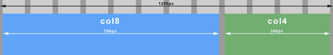 \n \n \n
 <div class="container">\n\t<div class="col8">\n\t</div>\n\t<div class="col4">\n\t</div>\n</div>\nbody {\n\tmargin: 0;\n}\n.container {\n\tmargin: 0 auto;\n\tmax-width: 1200px;\n}\n.col8 {\n\tfloat: left;\n\twidth: 65%; /* 780px / 1200px = 0.65 */\n\tmargin: 1em 0.83%; /* 10px / 1200px = 0.0083 */\n}\n.col4 {\n\tfloat: left;\n\twidth: 31.66%; /* 380px / 1200px = 0.3166 */\n\tmargin: 1em 0.83%; /* 10px / 1200px = 0.0083 */\n}\nWith all the flexibility provided by fluid grids, fixed width elements like images could quickly look out of place or disproportionate on large screens. They could just as easily break our layout on small screens when the container becomes smaller than the image itself. The trick here is to put our image in a fluid container and set the image to always fill its container (max-width: 100%).
\nUsing our earlier grid example, let’s float the image top left of the 8 column container and make it 4 columns wide (with a right margin). The important thing to note here is that the context has changed. We must now divide our desired image container width (target) by its 8 column container (context).
\n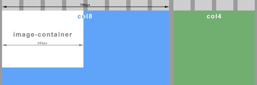 \n \n \n
 ...\n<div class="col8">\n\t<div class="image-container">\n\t\t<img src="images/my_image.png" />\n\t</div>\n</div>\n...\n.image-container {\n\tfloat: left;\n\twidth: 48.71%; /* 380px / 780px = 0.4871 */\n\tmargin-right: 1.28%; /* 20px / 780px = 0.0256 */\n}\nimg {\n\tmax-width: 100%;\n}\nNote your image must be of a sufficient size/quality so as to not look terrible on larger screens when the container is stretched. If you have constrained your overall layout with max-width as above, you can calculate the maximum width of the image container, and so the image (380px in our example).
\nThis is where the real magic begins. To be fluid and flexible is nice, but to be responsive is better still. Media queries, a feature of CSS3, allow us to change tack depending on certain specified conditions such as a change of screen width or device. I won’t delve into the evolution of the media query here, just to point out that we will be working with the media type ‘screen’ for all the examples.
\nImagine viewing our earlier example on a small screen. At some point our image will be too small to see any detail. Let’s prevent that from happening by changing the width of the image container to the full width of it’s parent (col8), effectively doubling the image width when the screen is smaller than a particular size (600px). Let’s create a ‘breakpoint’.
\n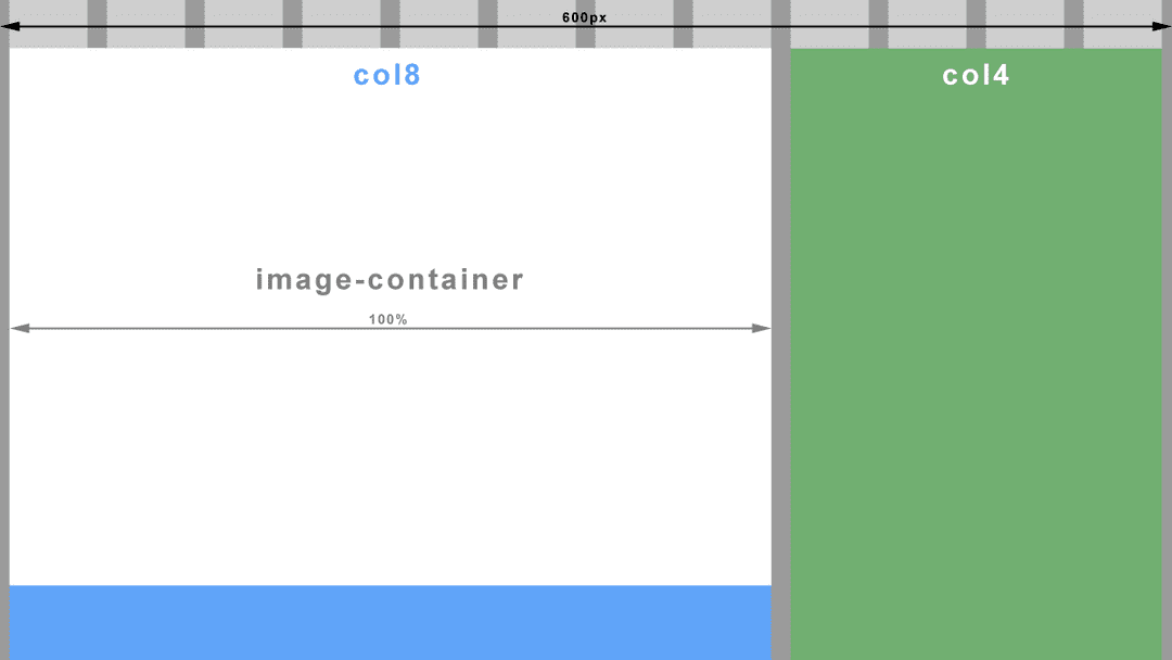 \n \n \n
 @media screen and (max-width: 600px) {\n\t.image-container {\n\t\twidth: 100%;\n\t\tmargin-right: 0;\n\t}\n}\nOn an even smaller screen, both our column containers (col8 and col4) would be so narrow that sentences would wrap after every two or three words. One solution could be to make all the columns the same full width and stack them on top of each other. Another breakpoint anyone?
\n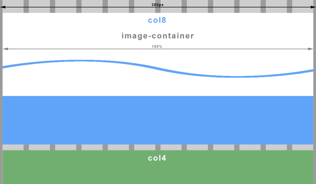 \n \n \n
 @media screen and (max-width: 380px) {\n\t.col8, .col4 {\n\t\twidth: 98.33%; /* 12 columns (exc. margins which stay at 0.83% each) */\n\t}\n}\nThroughout this article I have referred to screen width and screen size when what I actually mean here, is the viewport. If you’ve never heard of it before, it is apparently a window in a spacecraft! It is also however, the visible area of a web page. To put it another way, the viewport is the browser window. If you change the size of the browser window, you change the size of the viewport, which in turn triggers our media queries. I’m sure you have done this many times already when testing out the code from above (If you haven’t yet, go ahead and I’ll wait for you…..cool ha?).
\nNot quite. Historically, mobile browsers had to deal with the problem of displaying websites with fixed width layouts on a screen with a smaller resolution than the website. The solution was to specify their own viewport size for the browser wherein the browser would ‘pretend’ to be bigger than the resolution of it’s device. A larger website would then be scaled down to fit. The result unfortunately is an unreadably small website that you have to pinch and zoom (scale) to make out any detail. Then of course you have to drag the website back and forth just to read a sentence. We have all been there.
\nMoving on to present time, most smartphones have screens of at least 1280px wide in landscape and 720px in portrait and all crammed into less than 5 inches. The newer models come with Full HD 1920px by 1080px! No need for mobile browsers to pretend anymore. But hang on, that doesn’t fix the scaling problem. What we really need here is more control over the viewport so we can put an end to this madness and work within a predictable environment.
\nThankfully Apple invented the viewport meta tag. This tag allows us, the designers, to tell the browser what size we would like the viewport to be. Better still, all good browser vendors implemented this tag so we now have a uniform way to control the viewport size.
\n<meta name="viewport" content="width=device-width,initial-scale=1.0">What we are doing here is telling the browser that we wish the viewport width to be the same as the device’s actual screen width (changeable depending on rotation). We also instruct the browser not to zoom in or out by setting the scale factor to 1.
\nIf we threw a regular old fixed width layout at a mobile browser with the viewport meta tag set as above, we wouldn’t have achieved very much. Due to the large screen resolutions of modern devices, you would still have a tiny website displayed and probably with part of it cut off in portrait view. However, we aren’t building fixed width layouts anymore because they suck!
\nWhat we have achieved here is to level the playing field. We can now use max-width and min-width (which both relate to viewport width) in our media queries and get predictable results, regardless of the mobile browser. High five!! ...no? okay, maybe next time.
\nNow all we have to do is put sensible breakpoints (media queries) in our layout to create the best viewing experience for that viewport width. A word to the wise, do not try to build layouts for specific device classes like phone, tablet, phablet, etc. This is a moving target with screen resolutions getting higher all the time and new device classes appearing like smart watches. Use your design instinct here and insert a breakpoint when your layout begins to fail.
\nAnd with that I will leave you to experiment. Have fun!
\n\n
Next in the series - Responsive Web Design: Mobile First & Progressive Enhancement
',id:"/home/geoff/www/cornerpiece/geoffford.co.uk/src/pages/blog/23-02-2014-responsive-web-design-essentials/index.md absPath of file >>> MarkdownRemark",frontmatter:{date:"2014-02-23T02:31:49Z",path:"/blog/responsive-web-design-essentials",title:"Responsive Web Design: The Essentials"}}}}}}); //# sourceMappingURL=path---blog-responsive-web-design-mobile-first-and-progressive-enhancement-17a220cb36805c61346e.js.map